By Michael Dooley
Print Magazine
June 3rd, 2013
Peter
Kuper’s seen it all. And he wants us to see it, too. So he draws it
for us. His visits to Latin America, the Middle East, and beyond have
been providing him with perspective and inspiration for World War 3 Illustrated – America’s longest-running radical comic book anthology, since 1980. His various comics autobiographies include ComicsTrips: A Journal of Travels Through Africa and Southeast Asia.
And his graphic novel adaptions of classic literature by authors such
as Franz Kafka and Upton Sinclair have been translated into French,
German, Swedish, Portugese, Greek, and several other languages.


photo by M. Dooley
Peter’s accomplishments include creating the New York Times‘s first regular comic strip feature. With his mastery of multiple art media and a flair for rendering powerful, riveting images, he’s produced award-winning covers for Time, Newsweek, and numerous other publications. And he’s most known to the public for “Spy vs. Spy,” which he’s been drawing for Mad since 1997.
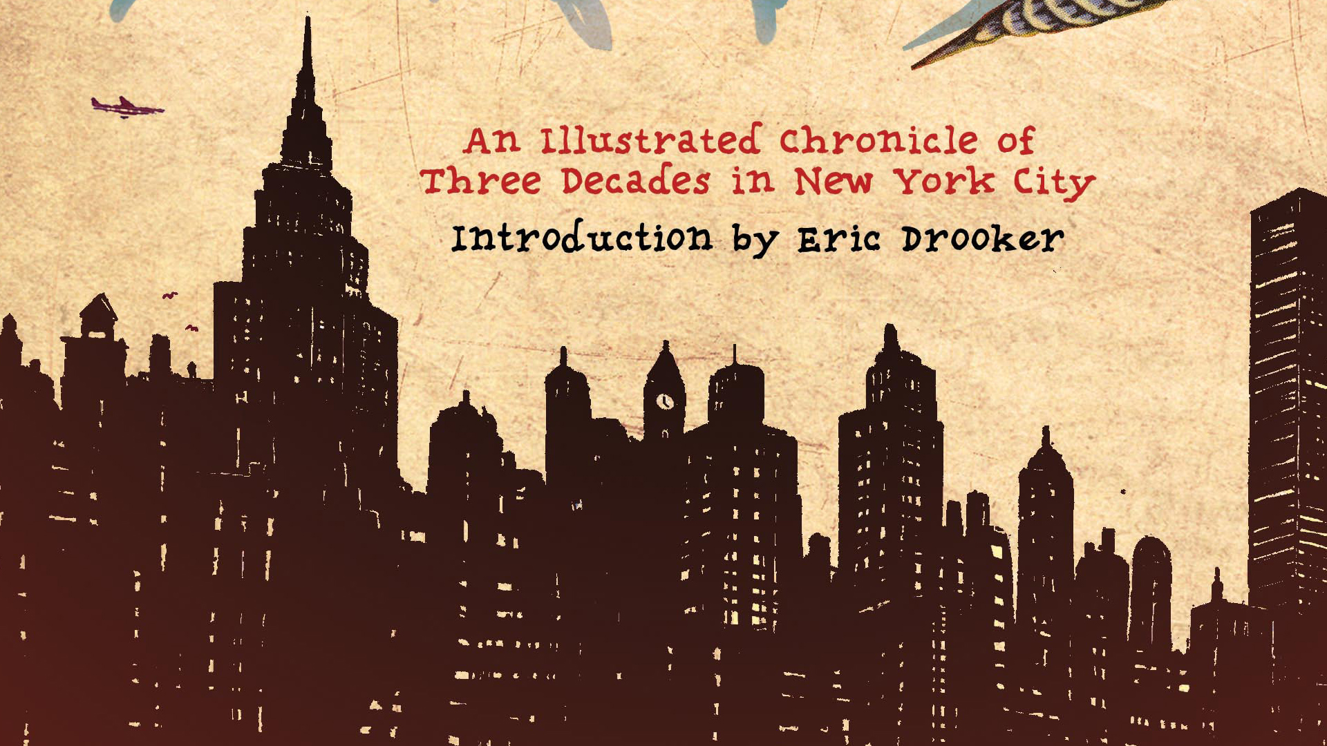
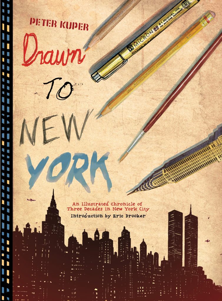
This summer, you can find Peter at his regular spot in San Diego Comic-Con’s Artists’ Alley, selling his original “Spy” artwork and rare collector’s items. He’ll also be promoting Drawn to New York: An Illustrated Chronicle of Three Decades in New York City, which just released this week.
Our conversation begins with his views of Manhattan and Mexico and covers a lot of ground, including his comics class at Harvard, his success at gaining a broad readership and reaching foreign markets, and his thoughts about print vs. digital media.
Unless otherwise noted, all images copyright © Peter Kuper.


How would you describe Drawn to New York and Diario de Oaxaca?
Both books are odd birds, falling between categories. They’re more like visual diaries of time periods in my life, reflecting the influences of specific locations.
And how are they different from each other?
New York, relatively speaking, seems to be in black and white, with its towering modern steel and glass structures in stark contrast to the humans who inhabit the city. Compared to most other places in the world – especially the laid-back nature of Mexico – the pace in Manhattan is intense – which I love – so the books reflect those vast differences.
Drawn to New York illustrates 30 years, including an era when the city was much more dangerous, down and dirty, then later, as it was gentrified for better and worse, through 9-11 and other stormy experiences – literally with Hurricane Sandy.
Diario de Oaxaca is a sketchbook journal primarily about a town in Mexico where I lived from 2006 to 2008. Oaxaca is an incredibly colorful place, sunny and warm 90% of the time, with 16th century architecture and nearby ruins of ancient civilizations. There was a huge teachers’ strike, people killed and a military presence during the first six months of my stay, which added a dark dimension, but that left the remaining year and a half to draw the glorious details of life in Mexico.

The pages of both these books appear quite vivid and luminous on electronic devices; do you see this as an advantage?
For the limited way I’ve used eBooks, this is the main benefit. It is really striking to see the pages illuminated this way, but not worth the loss of the tactile experience of a print book. I haven’t taken advantage of all the things that can be done within the form of eBooks, like open sources, linking to videos, or adding animation.
So, print’s your personal preference?
I’m really a print person, and need the feel of a book in my hands. I feel obliged to explore the options of digital since it’s clear that this is a direction books are headed. And of course, there are, and will be, many exciting things to be done in that medium, too.
Like many people, I have a real love/hate relationship with computers and everything that they’ve changed.


What’ve been your most successful works in foreign markets?
My adaptation of The Metamorphosis, thanks to the popularity of Kafka, has been translated in ten countries – including Israel, Turkey, Brazil, and the Czech Republic – so that’s the winner. But since I lived in Mexico I’ve done five books with my Mexican publisher, Sexto Piso, and that’s opened the door to a much wider relationship with Latin America, which is another kind of success. It’s also translated into many invites to book festivals throughout South America.
And what’ve been your experiences with overseas printing and publishing?
At this point most of my books are printed in Asia, and working directly with those printers and seeing what’s possible has given me many ideas for more elaborate printing: debossing, tipped-in plates, paper-wraps, etc.
As far as working with foreign publishers, it’s been generally fantastic, but the pay is much smaller than the bigger US publishers. Still, I’m thrilled to have the opportunity to reach new audiences with my work. And my relationships open other doors as well, with illustration work. I’ve been art directing and illustrating a weekly political piece for the French paper Liberation, which came through one of my publishers there.

Liberation illustration copyright © Peter Kuper

Liberation illustration copyright © Steve Brodner

Liberation illustration copyright © Edel Rodriguez

What did you learn from the reception that Stop Forgetting to Remember: The Autobiography of Walter Kurtz received?
Avoid faux autobiographies!
I had the “clever” idea of making it the autobiography of a fictitious cartoonist. This seemed reasonable, since I wanted to make adjustments to my story without cheating the truth. It seemed that the play was the thing and it was less important that it was my story. But some people were flummoxed by this.
It was later published in Spanish and French and I decided to drop the doppelgänger in those editions.


How will your approach to Ruins be different?
Ruins is a very different book for me. It will be my longest graphic novel, at about 300 full color pages. And it is a work of fiction, though I’m applying my experiences in Mexico and my interest in entomology. Nobody will mistake it for autobiography.


What first motivated you to express your political beliefs through visual commentary?
Fear was a big motivator. Ronald Reagan was about to become president when I was in art school, with a hostage crisis in Iran and his itchy trigger-finger ready to launch the bomb. I was desperate to have some kind of response, which was a big reason my friend Seth Tobocman and I started publishing World War 3 Illustrated. That title choice says it all!
How has WW3 Illustrated evolved over its 34 years?

One of the ways our magazine has expanded has been through bringing in younger people, including some of the students Seth and I have had at the School of Visual Arts. They bring a whole new set of ideas and connections. As a result we’ve ended up with more contributions from abroad, like cartoonists from Egypt. Many of these artists have never been seen in the US and they’re bringing stories based on first-hand experience, which is an area of journalism ideally suited to comics.
I’m currently editing a new issue, with dozens of contributors and a rotating group of editors.
What topics will it tackle?
This issue has an unusually light, upbeat subject: death.
We have stories ranging from the history of hell to a personal account of life on Death Row. There are comics about losing family members, and a look at how other cultures view death, like Mexico’s Day of the Dead. And there will be a series of photos of murals in Egypt commemorating people who died during the Arab spring.
Mortality is something we all face and comics are a great medium to express all the angles.
What makes a successful political cartoon?
One
that stops you in your tracks, enlightens, and makes you consider a
perspective you hadn’t previously entertained – maybe even to the point
of taking some positive action steps. If it can also have humor, it’s
win-win.
copyright © Jonathan Finn-Gamiño

copyright © Kayla Escobedo

copyright © Kayla Escobedo
How did you come to teach at Harvard?
There were enough students interested in comics that Harvard was pushed to include a course. How my name got thrown in the hat is still a mystery to me. Once I was asked – even though it’s a daunting commute from New York City to Boston and back every week – I couldn’t say no.
What was the nature of your class?
It’s really the same class I teach at SVA. It gives students all the building blocks necessary to create a solid comic page, from the most basic aspects of page design and lettering to the elements of a solid visual narrative.
All the assignments are strictly in black and white and complete beginning-middle-end in one page. I help them find stories worth telling based on personal experiences, dreams, adaptations, and journalistic approaches. I include a lot of comic art history through presentations and get them to each give a talk on an artist of their choosing. I also bring in guest lectures; Steve Brodner and Ben Katchor visited Harvard last semester. And at SVA over the years Peter de Sève, Gabrielle Bell, Seymour Chwast, and Matt Mahurin, among others, have given presentations to my students.
How did your Harvard students differ from your SVA students?

copyright © Kayla Escobedo
Generally the SVA students are all cartoon or illustration majors. On rare occasion they’re in film, but all related in one form another to art.
Of my Harvard students – 23 applied and I had to select 12, the maximum per class – only half were coming from an arts background.
I had an economics student and an English literature major and one who was doing medieval studies. They brought some interesting ideas to the table even though they were sometimes artistically starting from scratch.
Students like Jonathan Finn-Gamiño and Kayla Escobedo were in Harvard’s art program, so they were already producing developed work. For the ones that were first-timers I help them hone their skills through inspiring assignments and Gulag-esque critiques. They were all pretty responsive to this approach, though several said it was the most demanding class they took at Harvard!
How would you evaluate your course’s success?
Some of my students formed a comics club and began publishing a magazine when class ended, so my enthusiasm for the form must have rubbed off!


Which art media do you feel most comfortable with?
I like media that allows me direct contact with materials and that has an unpredictable outcome. Stencil and spray paint has that in spades, so I spent several decades working in that approach. Until I lifted the stencil, I wouldn’t know exactly what the result would be. Unfortunately, I do have a pretty good idea about the long-term effects of working with toxic materials, so I stopped using spray paint.
I also love scratchboard since it, too, has surprising results, like a fluid form of woodcut. Quality scratchboard, however, has been difficult to find, so I’m finding myself forced to dig up new mediums that will bring that element of mystery.
One of my recent favorites is a multicolored pencil with seven different colors in the tip; always an unexpected color with each scrawl.

How do you feel about the “cartoonist” and “graphic novelist” labels?
It used to be I’d rarely mention I was a cartoonist since it brought calls to reproduce some kind of “Superman” style. That used to be the main way people viewed comics. These days I’m able to refer to myself as a cartoonist without people presuming superheroes. And it’s a great conversation-starter at parties!
We still haven’t really found the right title to describe what we do. “Graphic novelist” is just the one we currently agree on. In the future it may be another moniker like “People of cartoonal” or “Comic-con Americans.” I don’t care, as long as I get to ply my trade.

What’s your advice to cartoonists who want to reach a broader readership beyond the usual fan base?
First advice is: learn about the history of the form. There are so many old masters to be discovered that serve as inspiration beyond the flavor of the moment: Winsor McCay, George Herriman, Lyonel Feininger, Harvey Kurtzman, etc. I’ve found, consistently, all successful cartoonists know their history.
Next – as much as I hate aspects of computers – the Internet provides many opportunities to reach a wider audience. Or so I’ve heard.
Third, it’s unavoidable – unless you win the art lottery – to end up doing a lot of free work. This is hard to face, but to create work that demonstrates your abilities often requires producing without remuneration. Most of my early comics – and plenty of recent ones – were done without pay, at least initially. WW3 Illustrated has never paid anyone, which may be the secret to our success!
I’m not glorifying poverty: it’s just important to not give up if the money isn’t there. If you do work from the heart that you really enjoy, fandom – and hopefully, filthy lucre – will follow.
Speaking of fans, do you have anything to say to yours?
I was as surprised as anyone to be chosen People magazine’s “Sexiest Cartoonist/Illustrator Man of the Year,” so thanks for all your votes.

Buy Drawn to New York: An Illustrated Chronicle of Three Decades in New York City: