By Rick Poynor
Design Observer
August 9th, 2012
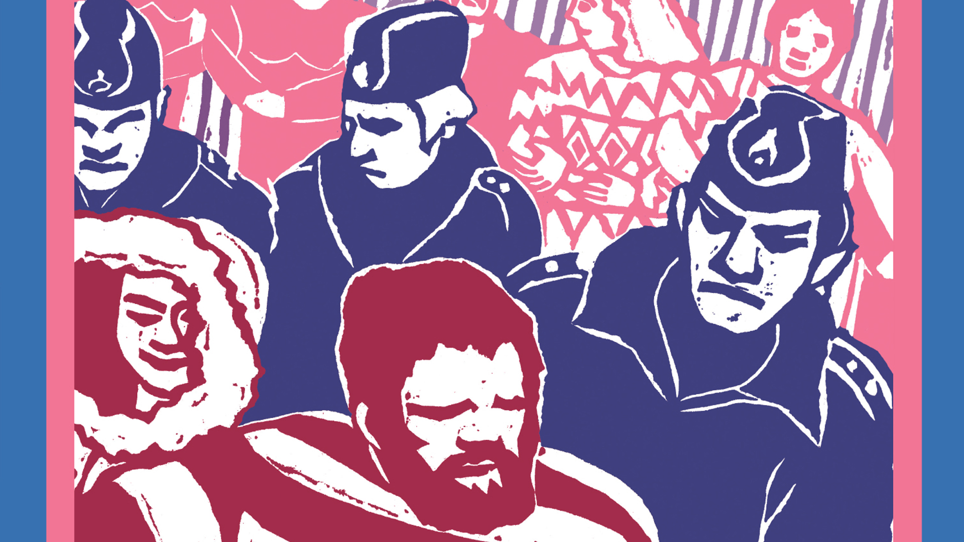
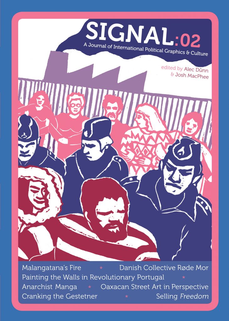
Signal no. 2, 2012, published by PM Press. Design: Alec Dunn & Josh MacPhee. Illustration: Røde Mor
If you are interested in the use of graphic art and communication in political struggles, don’t miss the latest issue of Signal, which has just come out. The first issue appeared in 2010, and for the last few months Amazon has been sending status updates saying that the new issue would be later than expected. The publishers must have unjammed the logs, though, and in the end it arrived early.
I can’t think of any other design or visual arts publication quite like Signal in form and content. “Journal” is exactly the right word here because Signal, published by PM Press in Oakland, California, is half way between a magazine and a book in appearance and tone. Its dinky size, combined with astutely pitched, matt-laminated cover designs, make it immediately intriguing and attractive. The page design is poised between scholarly seriousness and newsstand techniques of appeal. Signal is generously illustrated and would be rewarding merely to browse, but everything about it says: read this (because it will be a pleasure).
The journal is edited and designed by Alec Dunn and Josh MacPhee, who are both members of the Justseeds Artists’ Cooperative. Dunn is an illustrator and printmaker now studying at a nursing school in Pittsburgh. MacPhee is an artist, activist and curator based in Brooklyn. “We are internationalists,” they write. “We are curious about the different graphic traditions and visual languages that exist throughout the world.” Signal benefits greatly from the breadth of their non-American interests, which seem unusual to me in an American publication. Here’s MacPhee in an interview with the British radical magazine Red Pepper last year:
Over here in the States when you see any political graphics or artwork used at all, a lot of it is the same set of images, which have been used over and over again. But there is an incredibly rich amount of artwork and aesthetics that have been used in left/anti-authoritarian/liberation struggles all over the world, and I think we are in some ways hoping to expand the base of what people here think is possible.
It’s easy for a lot of political graphics to blend into our sensory landscape. For example, you see a poorly copied poster with a fist or a peace sign or an anarchy symbol and it’s an easy thing to ignore, because it’s boring! And often those uncreative, ineffective, posters are tied to uncreative and ineffective protests. Obviously, it’s not quite as simple as that, but I think we’re looking for ways that cultural work can help clarify political movements and work with them to feel more urgent or effective.
Spread from an article about Oaxacan street art considered in the Mexican context
The new issue has stories from Mozambique, Portugal, Mexico, Japan, Denmark, and early 20th-century London, as well as an American piece about the lost legacy of Gestetner art — an expanded version of a text first published online by the AIGA’s Voice (I’d prefer the space to have gone to an all-new essay). For me, the stand-out article in this issue is Kasper Opstrup Frederiksen’s illuminating reassessment of the graphic output of the Danish radical collective Røde Mor (Red Mother) from 1969 to 1978—they also had a band. This gives the flavor of their fire-breathing 1974 manifesto:
. . . the [highbrow art] culture monopoly works as a means to consolidate bourgeois power and the spread of bourgeois ideology in the working class. The bourgeois artist participates whether he likes it or not and whether he is conscious of it or not—in this repression. Contrary to this, we will make our art available to the working class and help to create a political, proletarian art.
Even in 1974, this kind of thinking was dated as both political analysis and communication strategy, and the article is clear-sighted about its shortcomings. But Red Mother’s socialist realist art inspired by Mayakovsky’s Rosta Windows and Frans Masereel still possessed graphic power. And, as Frederiksen writes, “the collective still serves as a reminder that by sharing information and pooling resources, artists can generate new exit routes from everyday life under capitalism as well as actively change people’s perspectives and values.” Clearly, new methods will need to be found now, and Signal’s commitment to visual communication could help to sharpen thinking about the task.
It has to be said that there are some moments of shaky editing, and the caption style is inconsistent, with figure numbers used in the text in one case but not elsewhere. It would be good to have information about contributors, making it easier to follow up interesting trails. In outline, though, Signal is already in vigorous shape, with a strong vision of what it wants to know and what it exists to do. To become fully established, it needs to appear regularly once a year; the last gap was too long. I also hope they will update their website with some new material. Take a look at the journal and support an excellent cause.
Back to Alec “Icky” Dunn’s Artist Page | Back to Josh MacPhee’s Author Page


