By Michael Dooley
Imprint.com
January 11th, 2013
As the Tea Party and Occupy movements fade from the political scene, anarchy is still visible . . . well, its graphics are, anyway. In England, Autonomy: The Cover Designs of Anarchy, 1961–1970 just hit the streets. And PM Press is singlehandedly keeping anarchy alive with an impressive catalog of revolutionary fare that covers everyone from Chomsky to Banksy to the Up Against the Wall Motherfuckers.
Established just five years ago, PM has already produced hundreds of radical-themed publications and other merchandise. They’ve done several graphic novel-ish books, the most stunning of which is Peter Kuper’s deluxe Diario de Oaxaca. And for richly illustrated perspectives of the ’60s countercultural press scene as seen by Paul Krassner, Trina Robbins, Emory Douglas, and other insiders, you can’t beat On the Ground. There’s also plenty to view and read in the first two issues of Signal: A Journal of International Political Graphics & Culture.
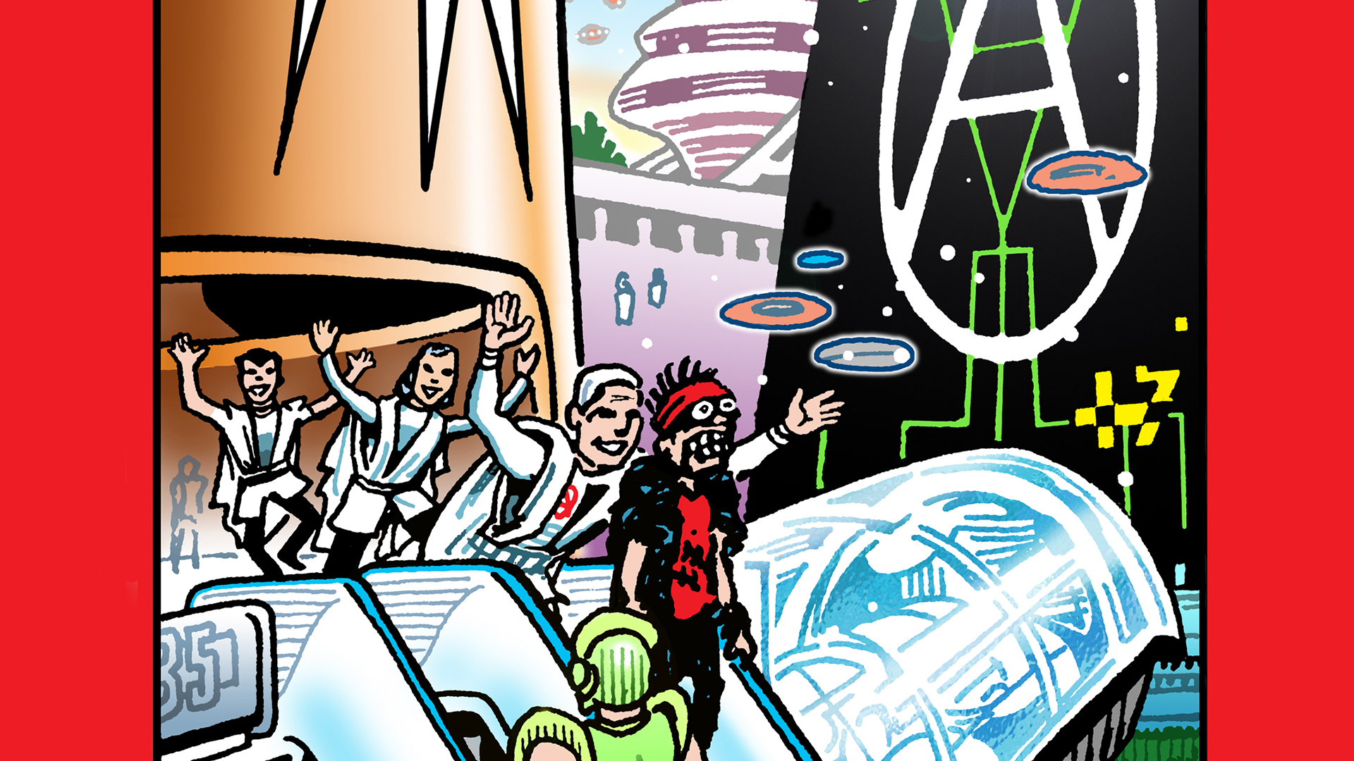
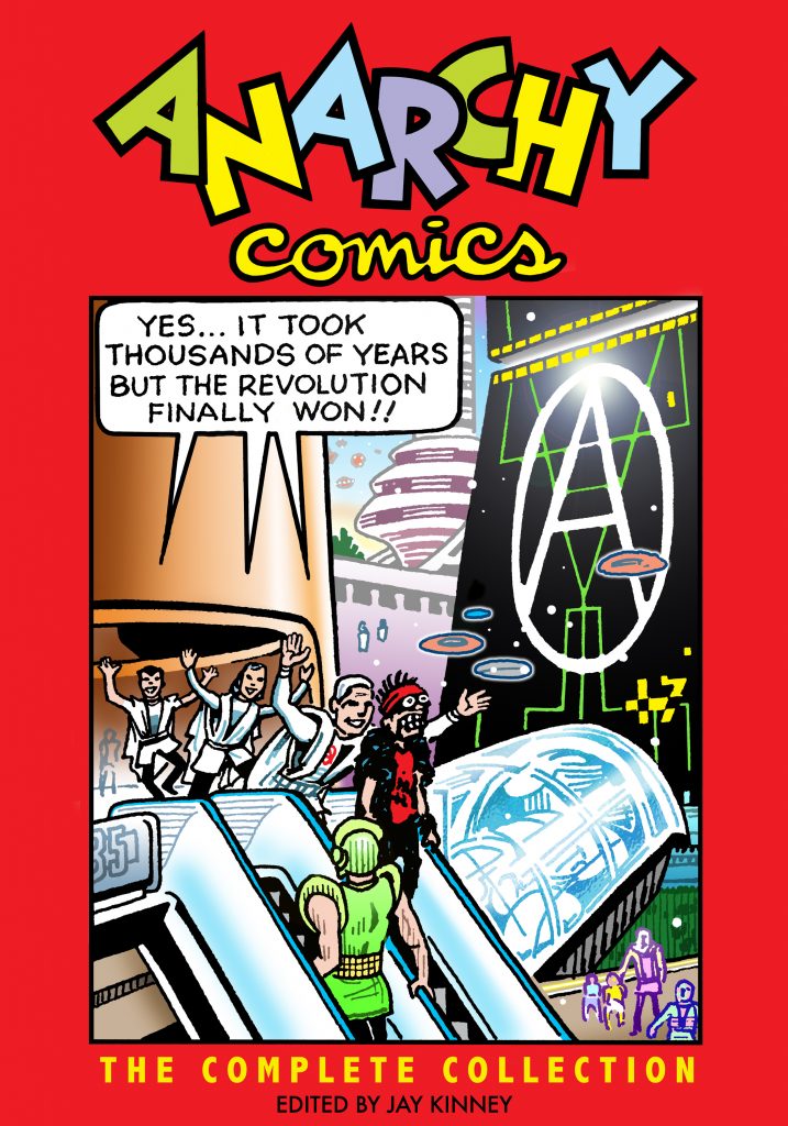
One new release that should be of particular interest to designers is the visually venturesome Anarchy Comics: The Complete Collection, edited by Jay Kinney and with a foreword by Paul Buhle. It’s an anthology of all four issues of the now-legendary underground comic book Kinney started in 1978, at the height of the punk revolution. Its dozens of contributors hailed from Great Britain and Europe as well as the U.S. and Canada, with artists as diverse as Gilbert Shelton and Gary Panter. Regulars included Lost Girls‘ Melinda Gebbie, the recently deceased Spain Rodriguez, and Kinney himself. And as you’d expect, each had his or her own take on the topic, whether educational, agitational, satirical, or all three.
Kinney was part of the original underground comix movement in the late ’60s, and he cofounded, with Zippy‘s Bill Griffith, the romance-comic parody series Young Lust. Our discussion below touches on Kinney’s friendship with Rodriguez, how anyone can now access loads of free comics online, and why political labels have become meaningless.
Anarchy‘s first issue started out with a bang, from Kinney’s burning Boris Badenov-ian globe bomb on the cover to his anarchically assembled opening strip, “Too Real,” which is where our conversation begins.
Jay Kinney
How did you put together “Too Real”?
Writing and designing “Too Real” was largely an exercise in amassing a pile of clip art and old ads from ‘40s and ‘50s magazines and letting a story line emerge as I moved the images around like chess pieces or Tarot cards.
Initially—and you can see this in the splash panel—I had the notion of tracing and re-drawing clip art, but it rapidly became clear that that added a layer of unnecessary work to the whole process. So I just went with the clippings themselves for the rest of the story.
This was at a time when I’d scored old Life and Colliers magazines for 50 cents apiece at flea markets and from the back rooms of dusty used book stores. Someone had given me a stack of old clip art and that became the unifying glue, because so many of the advertising images of happy families or dads and moms looked like they were nearly the same identical, squeaky-clean people. So it was surprisingly easy to find different clips that moved the story along with very similar-looking people.

Have you ever heard from David Rees?
I do know that it influenced Tom Tomorrow at the beginning of his career, but I have no idea whether it influenced Rees. I’ve never heard a peep from him, though obviously he’s been barking up a similar—if not the same—tree.
I can’t claim that I originated this collage mash-up technique, as the Situationists had already pioneered it. Collage was also a stock punk style, thanks in part to Jamie Reid, whose name I was unaware of. If I invented anything new, it was in combining the two veins of collage, along with a lot of smart-ass humor.
Tell me about your design training and early career.
I attended Pratt Institute in Brooklyn at a volatile time—’69 to ’72—with mixed results. Through happenstance and good fortune, I’d become involved with underground comix in ’68, when I was right out of high school, but my drawing teachers at Pratt definitely forced me to learn to draw. I also took illustration, design, and lettering classes, which I really benefited from. Unfortunately, the school was kind of a mess at the time—teachers wouldn’t show up on the first day of class and we’d be stuck with a substitute for the rest of the quarter. I dropped out in the middle of my junior year, as I was already making a meager living through freelance illustration and cartooning.
My real design training was from just being in New York and absorbing everything in the environment. My fellow students and I would ride the subway and for our own amusement identify the fonts used in the ads in the subway cars. Pushpin Studios was a big influence on me, but so were several professional cartoonists whom I met in New York and who shared tips about the craft of cartooning, such as Ralph Reese and Frank Mell.
Throughout the ‘70s I juggled comix work with illustration and paste-up jobs. But in the ‘80s I largely shifted into writing and editing for magazines. I was a graphics person at CoEvolution Quarterly—later Whole Earth Review—and then editor there before I founded my own magazine, Gnosis: A Journal of the Western Inner Traditions, which I published for 15 years. As the art directors of those magazines will testify, I always had strong opinions about the publications’ look and design.

What standards did you use when editing Anarchy, and how important was the visual factor?
Comics are a melding of the literary and the visual, so the visual element is always a big factor. One distinction of underground comix was that the editor—who was invariably a cartoonist—was in charge of delivering a fully-designed comic book to the publisher, with almost no inhibiting restrictions. This allowed great freedom in creating a comic’s design and style.
My own standards were pretty clear-cut: I only solicited artists whose work I enjoyed, who could come up with material that fit into the overall theme, and who I could count on to meet deadlines. Beyond that, I largely left them alone. There was a tradition of artistic autonomy in underground comix, so editors tended to only choose artists who they knew would turn in quality work. I was a traditionalist in that sense.
Probably the biggest chance I took on an artist was with Matt Feazell, who was relatively young and unproven. I allotted him four pages in Anarchy #3 and he came through with a wry, pointed, and well-crafted story that exceeded my expectations. Most everyone else, I had a good idea of what they’d probably do.
My concern has always been that the comic art that I create or edit communicates clearly. In my view, if you confuse the readers, you lose them and they’ll toss the book aside and move on to something else. So I tend to favor straightforward stories that read well, even if the reader is being challenged with sudden switches in art style or twists in the plotting.

Who do you consider Anarchy‘s most exceptional artists, graphically?
Since I consider most of Anarchy‘s artists to be friends, I’m reluctant to single one of them out as the most exceptional. I will note that I think the strips by Cliff Harper and by Melinda Gebbie were perhaps the most graphically striking, but every contribution had its own merits. Gary Panter probably pushed the envelope the most—no surprise there—but so did Peter Pontiac.

What was your relationship with Spain Rodriguez?
Considering that Spain was ten years my senior, he was simultaneously an older brother, a mentor, and, over time, my best friend. Still, there were periods over the last 43 years where we might only see each other twice a year, so our relationship was fluid, like many friendships.
Spain was a former biker, a visceral working-class Marxist, and an immensely talented artist. His drawing style could be called a mixture of Wally Wood and Chester Gould, but he made it utterly his own. He somehow managed to combine a penchant for drawing “hot babes” with a no-nonsense feminism that gave women their full due as autonomous, powerful beings. His instincts were always on the side of the underdog or the outcast, which I think sums up his underlying politics.
He supported the idea of Anarchy Comics from the very first time I brought it up. While he was a Marxist, he was not dogmatic about it, and we had many lively conversations about politics over the years. I think he especially appreciated the series because it allowed him to combine a certain EC war comics style with radical politics. While he would stick up for Stalin’s virtues well past the point that most of us would, it always seemed like his real heart was with the Anarchists during the Russian Revolution and the Spanish Civil War. We got along fine.

Which of the strips in your book feel most relevant today?
Paul Mavrides’s and my story “Armageddon Outtahere!” could just as well have been written in 2013 as in 1987. The same could be said for Sharon Rudahl’s “The Treasure of Cabo Santiago,” which contrasts the rich and poor in a Latin American country. Matt Feazell’s “Pest Control” is pretty timeless, as is Paul’s and my “No Exit.” And I’d say the historical strips by Spain and by Épistolier and his collaborators remain solid for offering glimpses of liberatory moments in world history.
Who among the new crop of comics artists do you admire?
To be perfectly honest, I’ve not kept up with most contemporary comics. When I’ve gone to the Alternative Press Expo in the recent past, the sheer amount of hopeful indie publishers and artists was overwhelming. I’d say the newest artist to catch my eye is Laura Park, but even she’s been around for a while. I do think she is fabulous. I admire Chris Ware and Dan Clowes; I think they are dazzling stylists, though their stories tend to trigger my own depressive tendencies, so I’ve not read all their work religiously. Los Bros. Hernandez are always good, but they’ve been at it 30 years already.
If you are talking newspaper funnies, my favorites are Dan Piraro’s “Bizarro,” Stephan Pastis’s “Pearls Before Swine,” Mark Tertulli’s “Lio,” and Patrick McDonnell’s “Mutts,” when it isn’t falling into sentimentality.
But my favorite “new” artists in recent years have been all the golden-age comic book artists whom I’ve been discovering, due to the scanning of public-domain comics at fan-run sites like Digital Comic Museum and Comic Book Plus. I’ve even helped out with some scans from my own collection of old comics. There were some terrific artists working for smaller publishers whose work has been previously obscure but who are beginning to find a new audience, such as Dick Briefer, Lily Renee, Mo Gollub, John Celardo, Harold Delay, Maurice Whitman, Rudy Palais, Fran Hopper, and the list just goes on and on. Great stuff.

When you started publishing Anarchy in 1978 you had left libertarian leanings. What are your politics these days?
I’ve spent much of the last 25 years questioning whether the old designations of “left” and “right” are even useful anymore. Certainly at a time when we have pundits and Tea Party types calling Obama a “socialist,” it seems like such labels have become meaningless. Surely the label “conservative” that so many people apply to themselves has become a misnomer. They aren’t conservatives, they’re radical reactionaries.
I suppose I’d still call myself a left libertarian or libertarian leftist, in the sense that I prefer democracy over autocracy, cooperation over competition, people over corporations, and so on. But I long ago gave up on the notion that a revolution—of whatever variety—was the answer. Attempts to make over a society from top to bottom usually end up backfiring, at least when they’re done in the service of an ideology, whether its Marxist, Islamist, Zionist, or whatever. Even back when we were originally doing Anarchy Comics, much of my satire was aimed at the competing claims of different leftist sects and belief systems.
Of
course, these days it’s hard to even point to a coherent left or right
in American politics. We’re just living in a sci-fi future where
everyone generates their own reality bubble to the point where we might
as well be living in parallel universes. One could say that both the
Tea Party and the Occupy movement represent two very different kinds of
popularized anarchism, so it’s perhaps rather timely to have all the
issues of Anarchy back in print again in the anthology.